Obsium
Information Technology
website
Branding

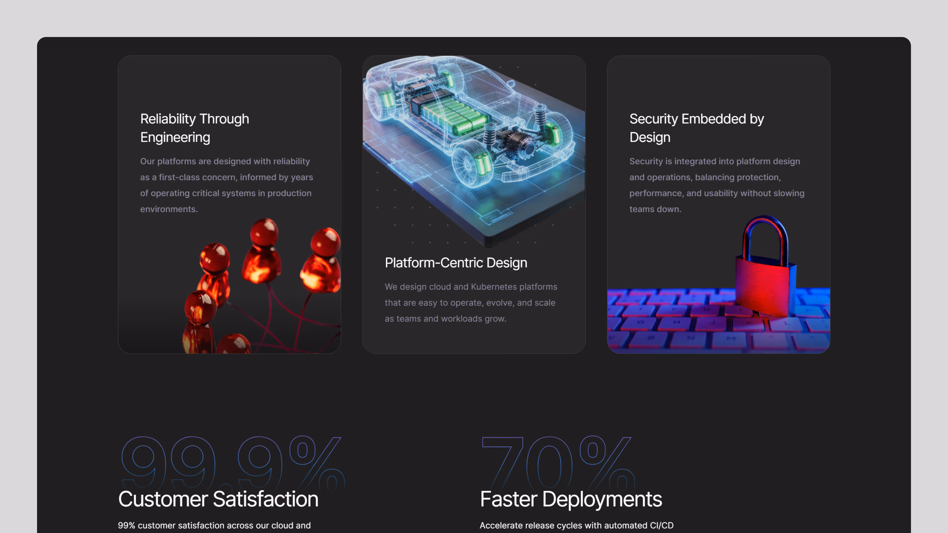
In an increasingly complex cloud ecosystem, businesses need streamlined systems that are easy to manage and built to scale. Obsium delivers structured, reliable cloud solutions that bring clarity and efficiency to infrastructure management.
Obsium is a forward-thinking brand built around clarity, precision, and minimal sophistication. As the brand evolved, its digital presence needed to reflect its growing maturity, positioning, and modern outlook.
Fineart Design Agency partnered with Obsium to revamp its website and refine its brand identity, creating a cohesive and high-performing digital experience. The goal was to go beyond aesthetics — building a platform that communicates clarity, improves usability, and strengthens brand perception.
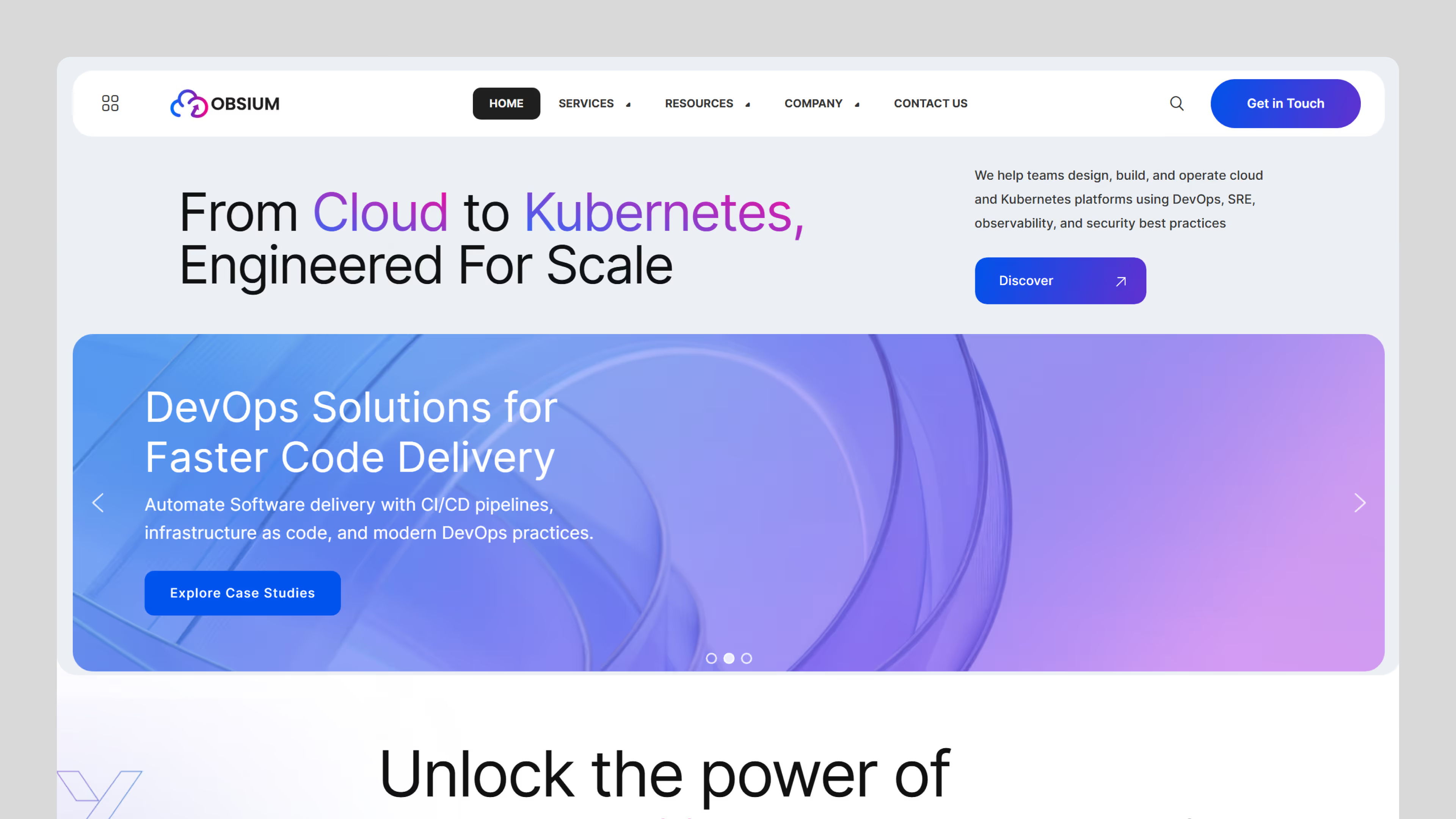
With a focus on structured design, intuitive navigation, and visual consistency, the new experience transforms Obsium into a confident, scalable, and digitally refined brand.
The primary goal for Obsium was to create a modern website that aligns with its evolving brand identity while delivering a seamless and intuitive user experience. The platform needed to communicate clarity, enhance usability, and establish a strong digital presence.
Creating a website that reflects Obsium’s modern, minimal, and confident brand identity while improving overall perception.
Structuring content in a way that allows users to quickly understand information and navigate effortlessly across the website.
Developing a flexible UI system that ensures consistency across pages and supports future growth.
Designing intuitive user flows that reduce friction and guide users naturally through the interface.
Creating a responsive design that performs seamlessly across mobile, tablet, and desktop environments.
Designing Obsium’s digital experience required maintaining its minimal brand identity while improving usability and engagement. The challenge was to simplify without losing depth.
Adapting a minimal and abstract brand identity into a structured and engaging website interface.
Ensuring the interface remains clean while still delivering clear navigation and functional depth.
Reorganizing content to improve readability, hierarchy, and overall user understanding.
Maintaining a cohesive look and feel across different devices and screen sizes.
Designing a visually refined interface that also supports speed, responsiveness, and usability.
Our design process focused on clarity, structure, and scalability, while ensuring the brand identity and digital experience evolved together as a unified system.
We worked with stakeholders to define Obsium’s brand and digital strategy,
ensuring alignment across touchpoints.
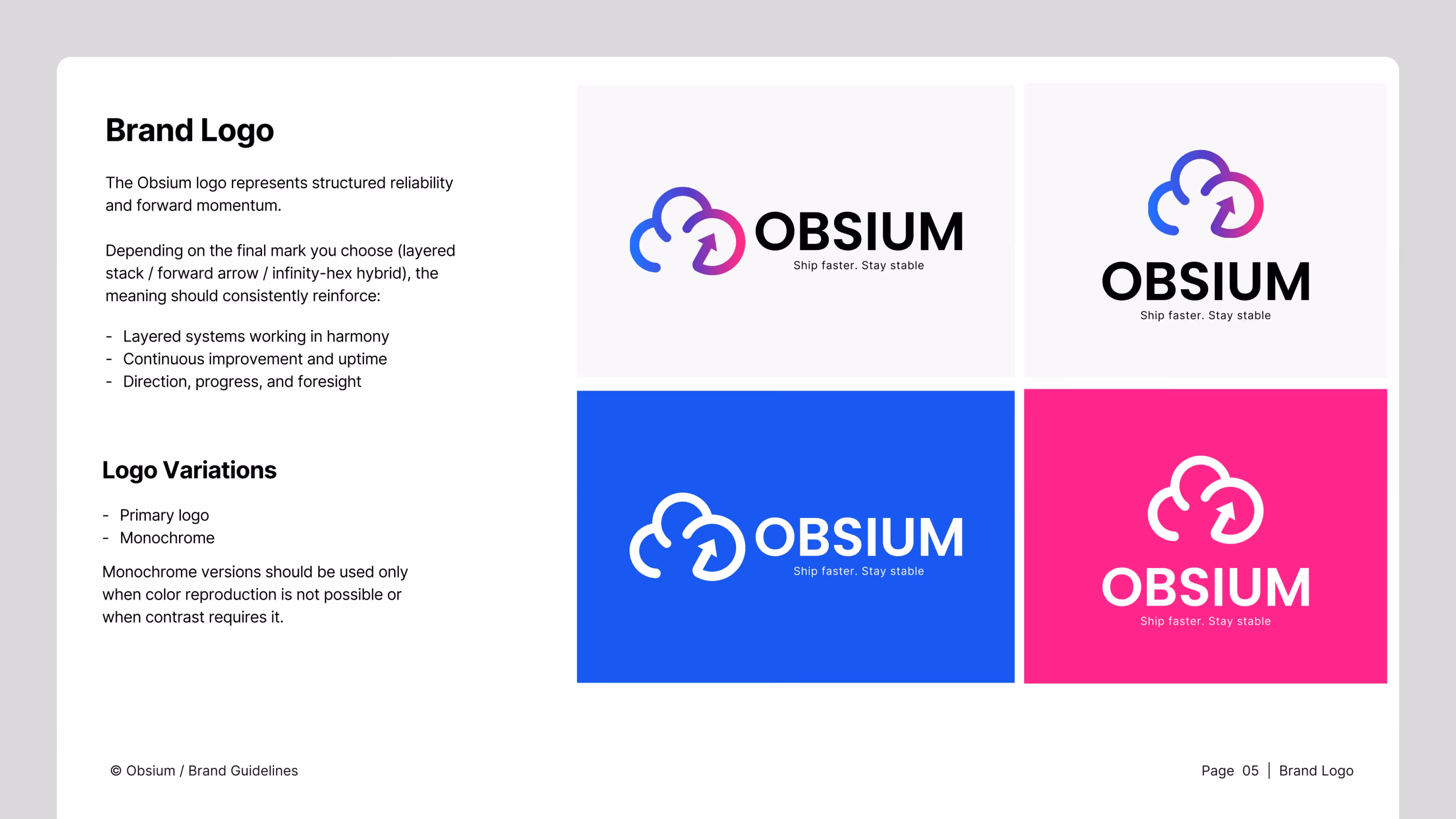
We updated Obsium’s visual identity, refining the logo, typography, and color palette for a modern, cohesive brand.
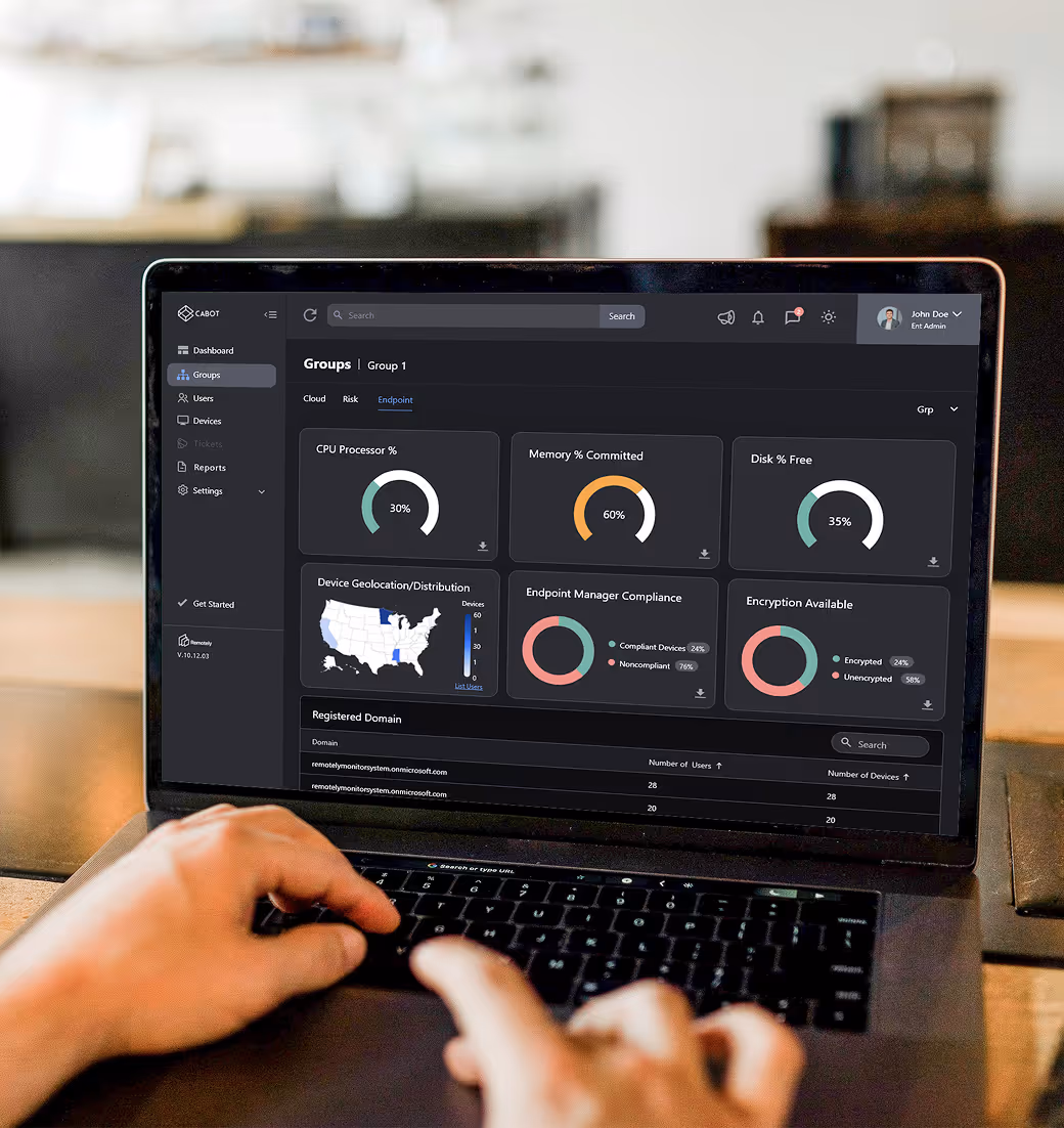
We redesigned the website for a clear hierarchy, ensuring easy navigation and quick access to key information.
Low- and mid-fidelity wireframes mapped user journeys, validated layouts, and optimized content flow for a smooth experience before visual design.
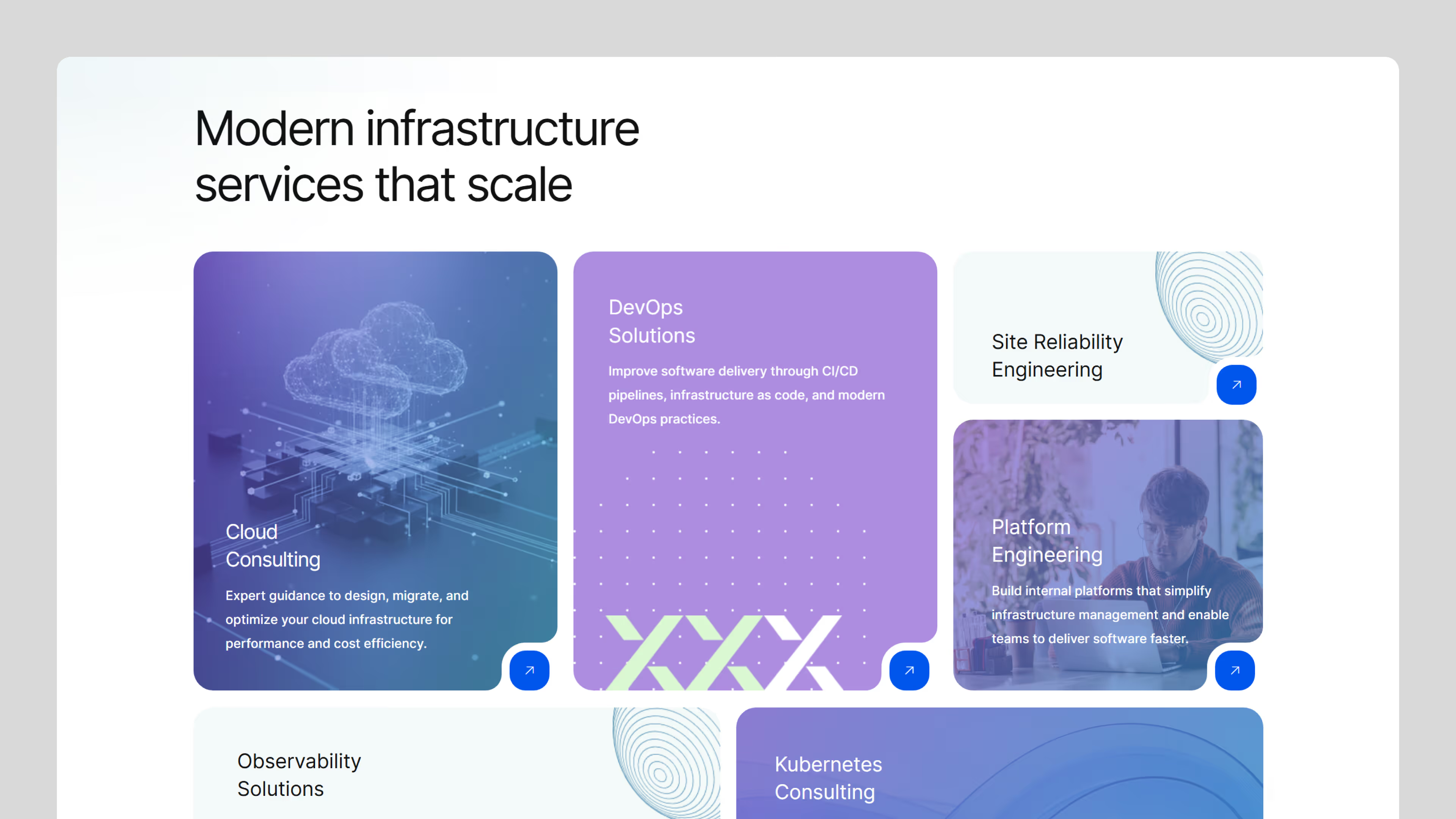
We designed a modern, minimal interface with structured layouts, bold typography, and balanced whitespace for clarity.
A scalable design system unified branding and UI with standardized components, typography, and color for consistency and flexibility.
The design was refined for consistency across devices, with iterations enhancing usability and coherence.
The Obsium website transformation resulted in a clean, structured, and user-focused digital experience aligned with its evolving brand identity, improving content clarity and navigation, strengthening brand consistency, enhancing usability across devices, streamlining user journeys, and establishing a scalable design system. With a refined visual language and a more intuitive experience, Obsium is now positioned as a modern, confident, and digitally mature brand.